Data Analytics Learn the basic theory of statistics and implement it in Python (Part 4, Pearson's correlation coefficient)
23-03-22
본문
Understanding correlation coefficients is crucial in business.
It can be extended to identifying relationships, modeling forecasting and risk management to infer causality.
1. Identify relationships:
It helps you understand the strength and direction of relationships between variables. Understanding these relationships can help you identify trends, patterns, and potential causal relationships to inform your decision making.
2. Predictive modeling:
Often used in predictive modeling to determine which variables have a significant impact on the target variable. By including only the most relevant variables, businesses can create more accurate and effective predictive models for forecasting, customer segmentation, or demand planning.
3. Risk management:
It can be used to manage risk by identifying relationships between various assets or market factors. For example, understanding the correlations between the stocks in your portfolio can help you diversify your investments to minimize risk.
4. Hypothesis testing:
Correlation coefficients provide a quantitative measure to test hypotheses about the relationship between variables. This allows businesses to make informed decisions based on evidence rather than relying on intuition or anecdotal evidence.
5. Optimize:
Understanding the relationships between variables can help optimize processes, resource allocation, and marketing strategies. For example, if a strong correlation is found between ad spend and revenue, businesses can strategically allocate ad budgets to maximize revenue.
6. Infer causality:
While correlation does not imply causation, it can be used as a starting point for investigating potential causal relationships. By identifying variables that are highly correlated, companies can dig deeper into the relationship and discover causal factors that can potentially be leveraged for growth or risk mitigation.
In summary, understanding correlation coefficients is important to your business because it helps you identify relationships between variables, inform decision making, optimize processes, manage risk, and support forecast development.
So, let's take a look at correlation coefficients.
There are several types of correlation coefficients, and I'll explain the three most commonly used. Values range from -1 to 1, with a positive value indicating a positive correlation and a negative value indicating a negative correlation.
A correlation coefficient of zero can be interpreted as no linear relationship between the two variables.
There are Pearson's correlation coefficient, Spearman's rank correlation coefficient, and Kendall's rank correlation coefficient.
1. Pearson's correlation coefficient:
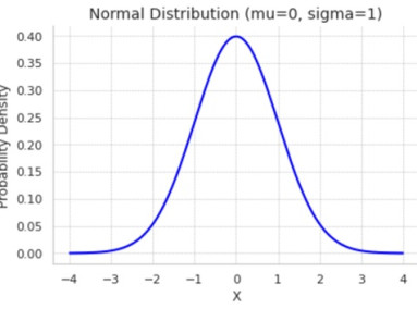
A measure of the strength of a linear relationship between two variables, assuming the data is normally distributed and the relationship is linear.
2. Spearman rank correlation coefficient:
Measures the strength and direction of the relationship between two variables without assuming linearity or normal distribution. Instead, it is based on the rank values in the data, making it more suitable for non-linear relationships or non-normally distributed data.
3. Kendall's rank correlation coefficient:
Similar to Spearman's rank correlation coefficient, Kendall's rank correlation coefficient measures the strength and direction of the relationship between two variables based on their ranked values. It is less sensitive to outliers than Spearman's correlation coefficient.
I'm only going to cover Pearson's correlation coefficient because it's the most commonly used.
Advantages of Pearson's correlation coefficient include:
1. Easy to calculate and interpret
2. Widely used and understood
3. suitable for linear relationships and normally distributed data
Let me explain with a simple example.
For example, let's look at weather and ice cream sales, where the two variables are temperature (weather) and ice cream sales.
Let's say you have data like this
- temperature: 10, 15, 20, 25, 30, 35, 40 degrees
- Ice cream sold: 100, 150, 200, 250, 300, 350, 400 units
We can see that there is a positive correlation: as the temperature increases, the amount of ice cream sold increases. In this case, the Pearson correlation coefficient approaches a positive value.
In this example, it would probably be closer to 1 because, although I've used an example, I've organized the data so that ice cream sales are exactly proportional to the increase in temperature.
- import numpy as np: Import the NumPy library, a popular library for numeric operations in Python, and alias it "np" for ease of use.
- rd_spending = np.array([...]): Create a NumPy array containing 10 years of sample R&D spending data for the company.
- annual_revenue = np.array([...]): Create a NumPy array containing 10 years of sample annual revenue data for the company.
- pearson_corr_coefficient = np.corrcoef(rd_spending, annual_revenue)[0, 1]: Use the following to calculate the Pearson correlation coefficient between R&D spending and annual revenue.
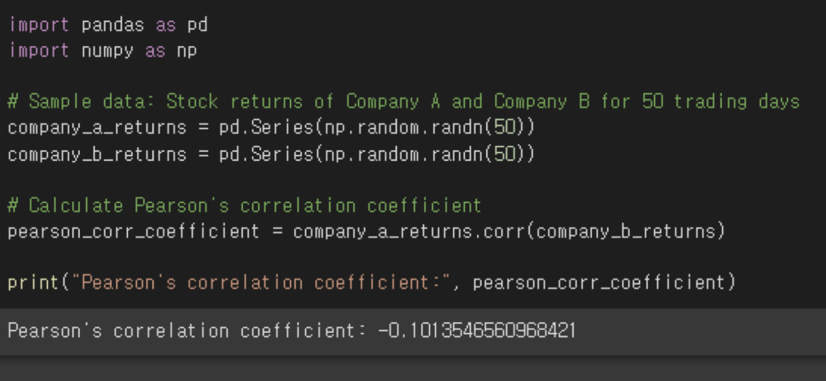
As shown below, the correlation coefficient changes based on the data.
A correlation of -0.1 is close to zero, which means that there is virtually no relationship between the two pieces of data.

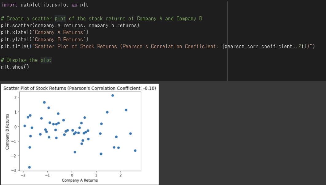
The correlation coefficient can also be visualized intuitively, as shown below. In Python, you can use a library called Matplotlib.

- import matplotlib.pyplot as plt: Imports Matplotlib's pyplot module, which supports MATLAB-style graphing, where "plt" is used as an alias.
- plt.scatter(company_a_returns, company_b_returns): Generates a scatter plot of the stock returns of Company A and Company B. This scatter plot provides a visual representation of the relationship between the stock returns of the two companies.
- plt.xlabel('Company A Returns'): Set the x-axis label to 'Company A Returns'.
- plt.ylabel('Company B Returns'): Set the y-axis label to 'Company B Returns'.
- plt.title(f"Scatter Plot of Stock Returns (Pearson's Correlation Coefficient: {pearson_corr_coefficient:.2f})"): Sets the title of the graph and includes the correlation coefficient in the title. To embed a variable within a string
f-string to insert the variable within a string, and :.2f to display the correlation coefficient value to two decimal places.
- plt.show(): Displays the generated graph on the screen.
This code generates a scatter plot between stock returns, calculates the correlation coefficient, and displays it in the title of the graph.
This allows you to visually understand the relationship between the returns of two company stocks and interpret the correlation coefficient.


